Recessive Color : 8 Eye-Catching Niches, Nooks and Crannies
One of my favorite ways to bring a bolt of vibrant color into a room is to paint the interior of a niche or nook. Niches are small, open areas typically used for storage or display, making them the perfect spot for dramatic color. Not only do you create a focal point — allowing the items on view to take center stage — but the small dash of color can also help break up an otherwise neutral space. I’ve pulled together eight examples of boldly colored niches, nooks and crannies, as well as color palettes inspired by each space in case you want to get the look in your own home. It’s recess time!

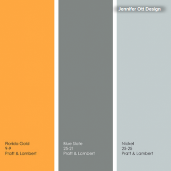
I like the mix of traditional fixtures and materials with the modern color palette in the bathroom shown here. The hot orange hue really warms up the cool blue-gray and white.
Note: Due to differences in how interiors are lit and photographed, as well as how computer monitors are calibrated, the colors you see in these swatches and photographs may differ slightly from the actual colors. Always do a reality check and view actual paint swatches from the manufacturer, or better yet, evaluate a large paint sample of the color you are considering before finalizing your selection.
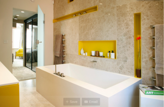
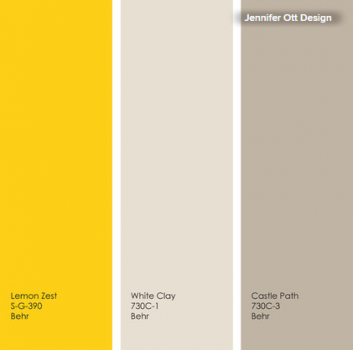
I once painted my powder room in a color that can be best described as highlighter yellow, only to have to repaint it another hue the very next day because the yellow gave me a splitting headache. So trust me when I say that a saturated lemon yellow is way too intense in large swaths. But it’s the perfect accent hue for the niches in the bathroom shown here. Keep the rest of the palette light and neutral if you want a soothing vibe.

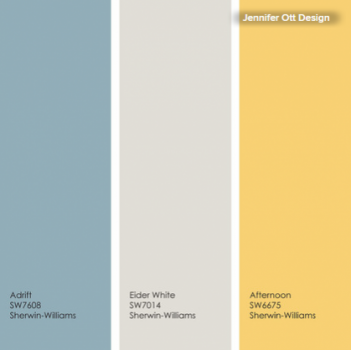
White kitchens continue to be popular among homeowners, but I encourage you to make your white kitchen stand apart from the crowd by adding accents of a fun color or colors that you love. If you have open wall cabinets, try painting the interior panels in your favorite vibrant hue.
Of course, this will make the cabinets a focal point, so make sure you’ll be able to keep those shelves neat and tidy and stocked with items that are worthy of being on display. I like to put in a mix of open and closed cabinets, so there’s the flexibility to display worthy items and hide the not-so-worthy.
If you cook often or do a lot of frying and sautéing, be aware that grease buildup on displayed items can be an issue. This can be mitigated to some degree by installing a powerful exterior-venting hood and by displaying only items that you use frequently — so that they get washed regularly.
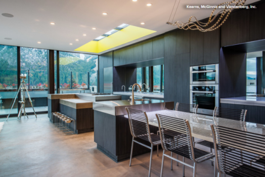

Don’t forget skylights and window returns as areas worthy of an accent color. A bold greenish-yellow will provide an energizing glow when lit by the sun. I love this color, but it’s another one that is best used with restraint. A mix of light and dark neutrals rounds out the palette nicely.

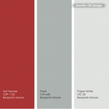
This bold shade of red is another hue not for the faint of heart. Use it strategically to call attention to an interesting architectural element or as a backdrop to your favorite collection. You can keep the palette warm by pairing red with brown and golden hues, or cool it down with a blue-green-gray neutral, as seen here.
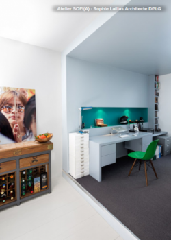

Add some pizzazz to an otherwise sleek and minimalist space with a bold splash of color. You can even fake a window in a windowless area by painting the cutout a blue or green that evokes the sky, the sea or vegetation. Add lighting within the niche to intensify the effect.
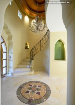

Fun color need not be limited to modern and contemporary spaces. A grassy green really freshens up this niche. The soft, pretty color palette warms up the cold, hard materials used in the entryway nicely. It feels less formal and intimidating with such a friendly palette.
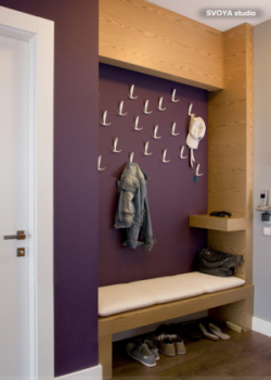
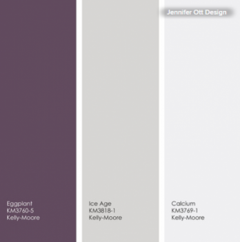
This wall probably sees a lot of wear and tear, so the dark eggplant hue is a smart choice to disguise any scuff marks. In an area like this, be sure the paint finish has some sheen, such as eggshell, satin or even semigloss, to make it easier to scrub clean.
Data Form : houzz.com Terra BKK, PROPERTY KNOWLEDGE YOU CAN TRUST